|
Tuscany paint colors and art for a perfect Tuscan color palette by artist Linda Paul.

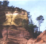
pigment ocher mine
|
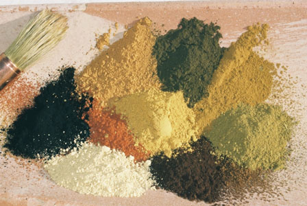
| Tuscan colors are a must in today's decorating scheme says artist Linda Paul. We love these colors because they are warm and inviting. Picking that perfect shade of Tuscan red or green can be tricky, but you need to go no farther than mother nature to get it right. What makes this artist an expert on Tuscan colors? American artist Linda Paul uses actual natural earth from Tuscany to create her paint. It was mother nature who created these colors that have been around for thousands of years. The colors come from earth ocher which evolves in sedimentary layers of color that run the gamut of cream, yellow/gold, rusty oranges, orange/reds, brown reds, and deep browns. In the area around Verona Italy, the earth is actually a sage green color. Luckily with today's technology we can perfectly match these colors for house paint and home decorating |
|
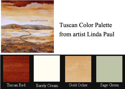
Here are some examples of classic Tuscan color palettes
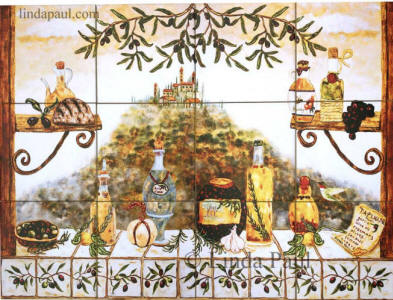
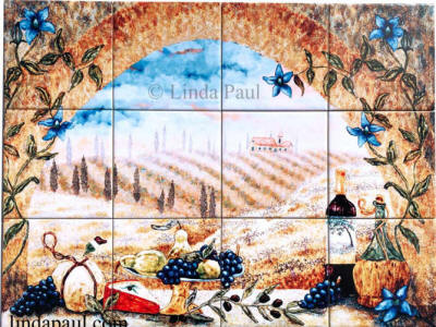
In this painting of a Farmhouse in Tuscany, the artist has used a tuscan color palette of cream, pale gold, rusty red and sage green, all from natural earth mixed with egg yolk. You can recreate this same color palette in your home by using these colors
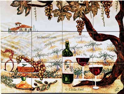
A little brighter palette is seen in Linda's
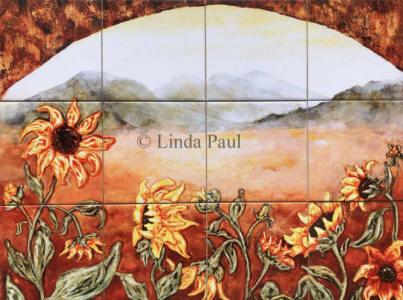
Sunflower Field with fabulous Tuscan colors of yellow-gold, sage green and rusty orange will cheer up any room's decor.
|
|
|